The craving for Kotipizza.
-
Client
KOTIPIZZA
-
Deliverables
Brand Identity Brand Elements Brand Materials Illustrations by Antti Kalevi Motion Design Package Design 3D Design by Boutique
-
Year
2025
ABOUT THE PROJECT
Kotipizza has been one of Finland’s most recognized food brands since 1987. Nearly everyone knew it, but high awareness had turned into familiarity rather than preference. Consumer behavior had also changed. Sustainability, once a strong purchase driver, had lost much of its power, while price sensitivity and instant desire had grown.
The brand didn’t need small optimizations. It needed a clear shake-up in perception that would make people actively choose Kotipizza again.
OUR PROCESS
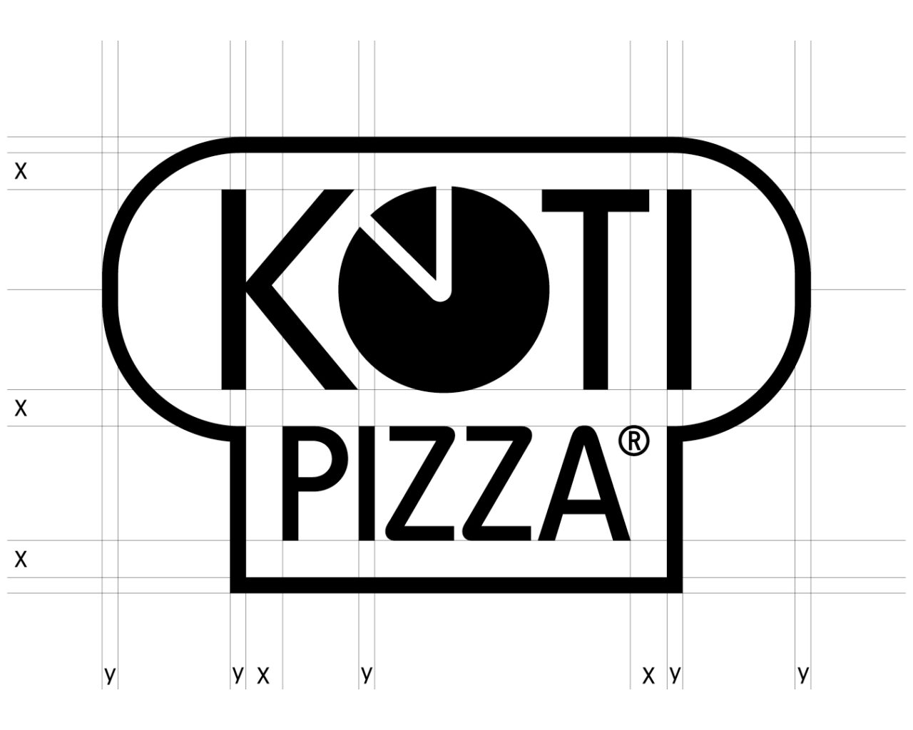
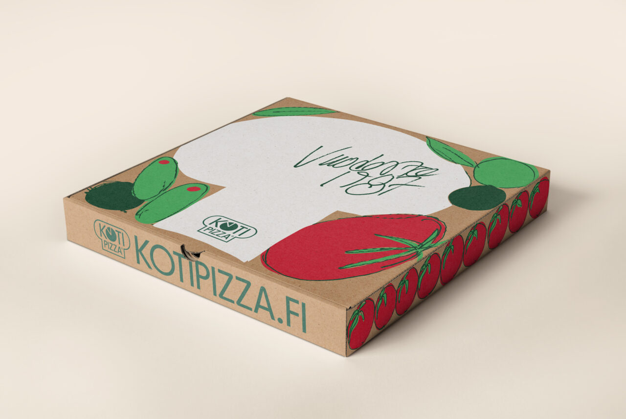
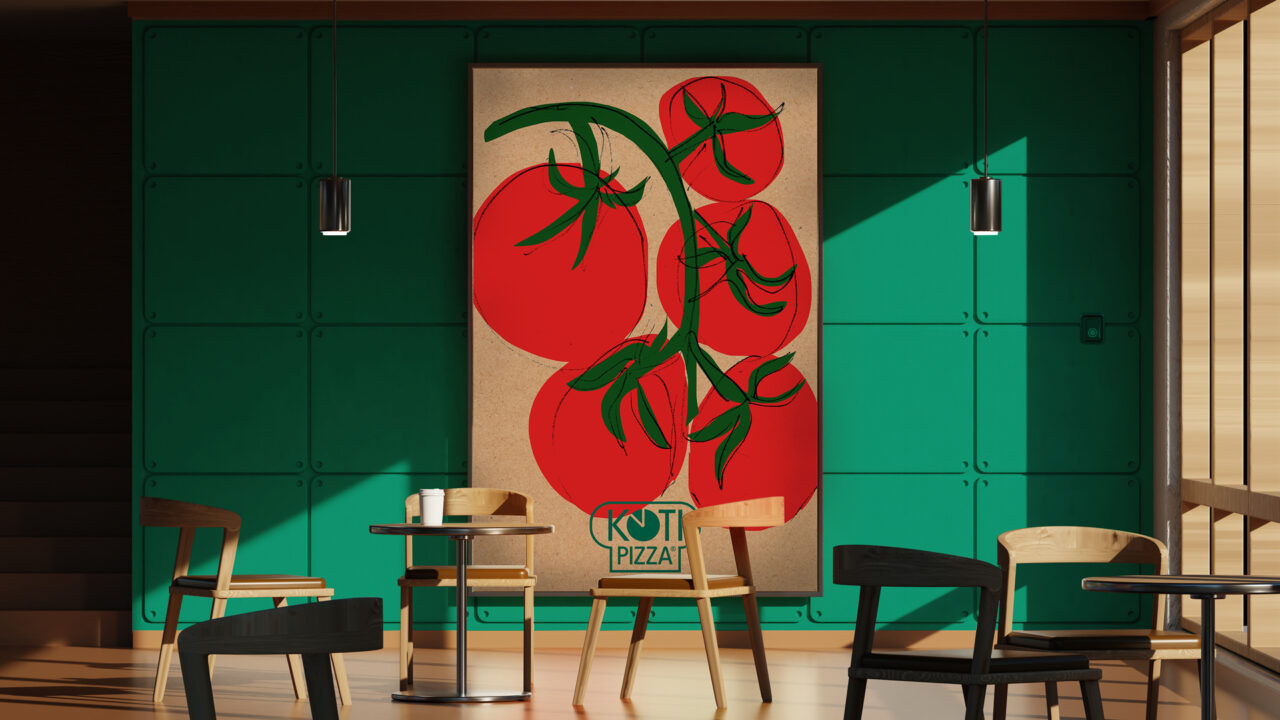
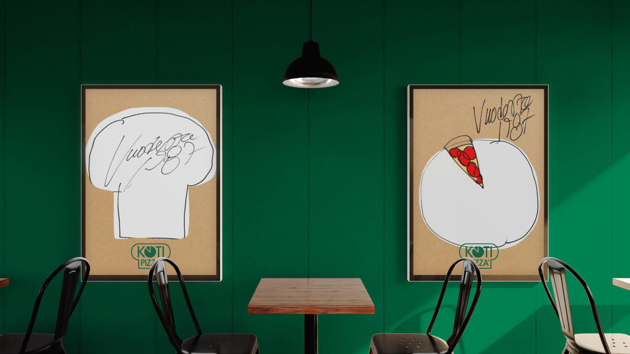
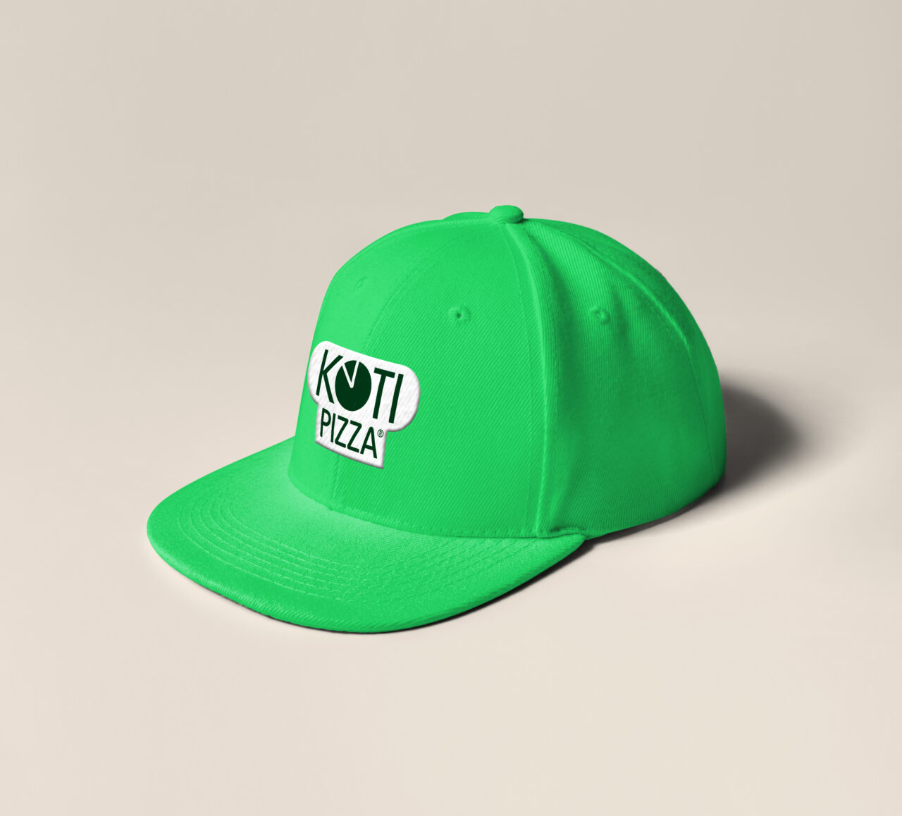
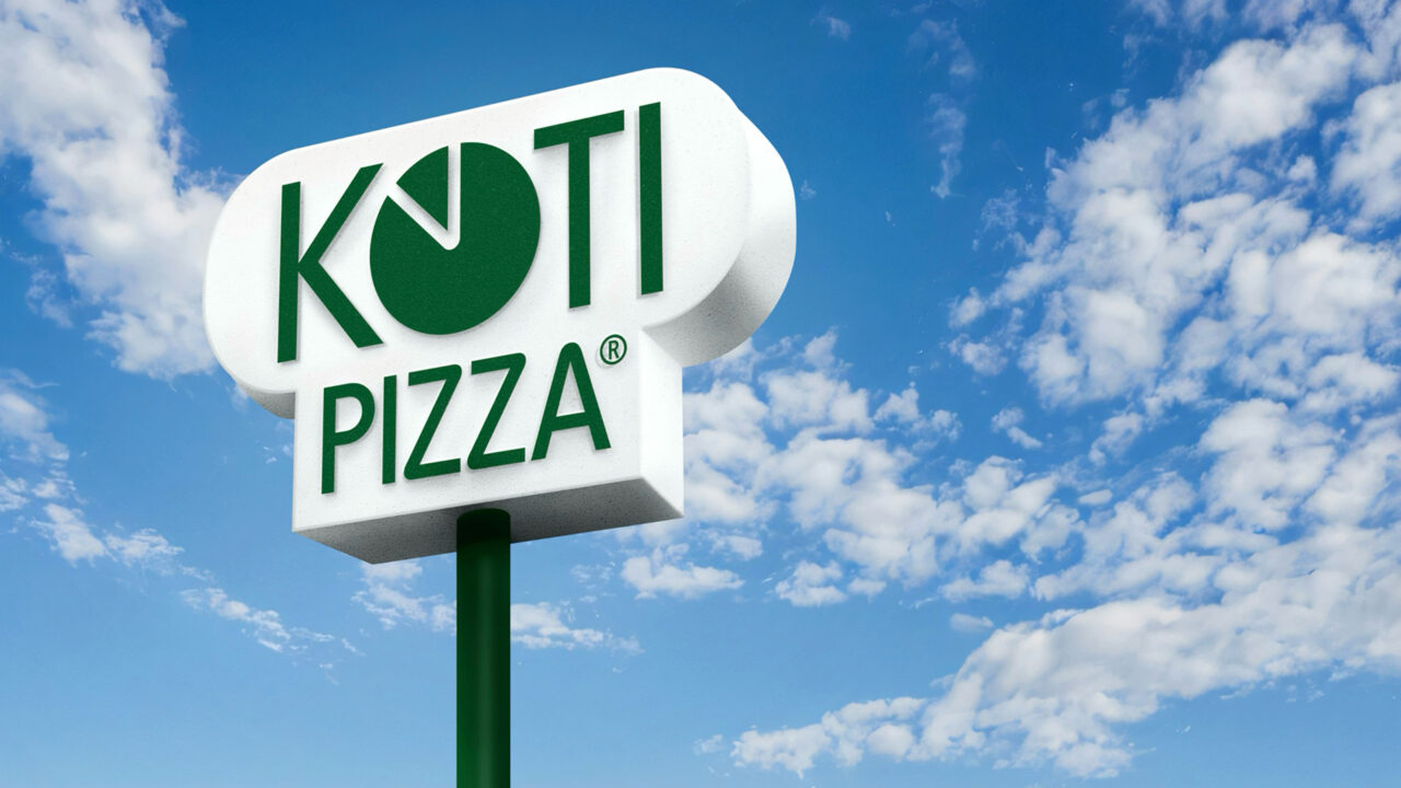
We started with a business and brand strategy that positioned Kotipizza as an innovator, built around small celebratory moments that make you go “Jee!” and the brand’s most distinctive truth: its dough and unique taste. The renewed identity brought the iconic chef’s hat back as the focal point of the logo. A vibrant new signature green leads an expanded palette drawn from the ingredients themselves: cheese, pizza dough, tomatoes and pepperoni.
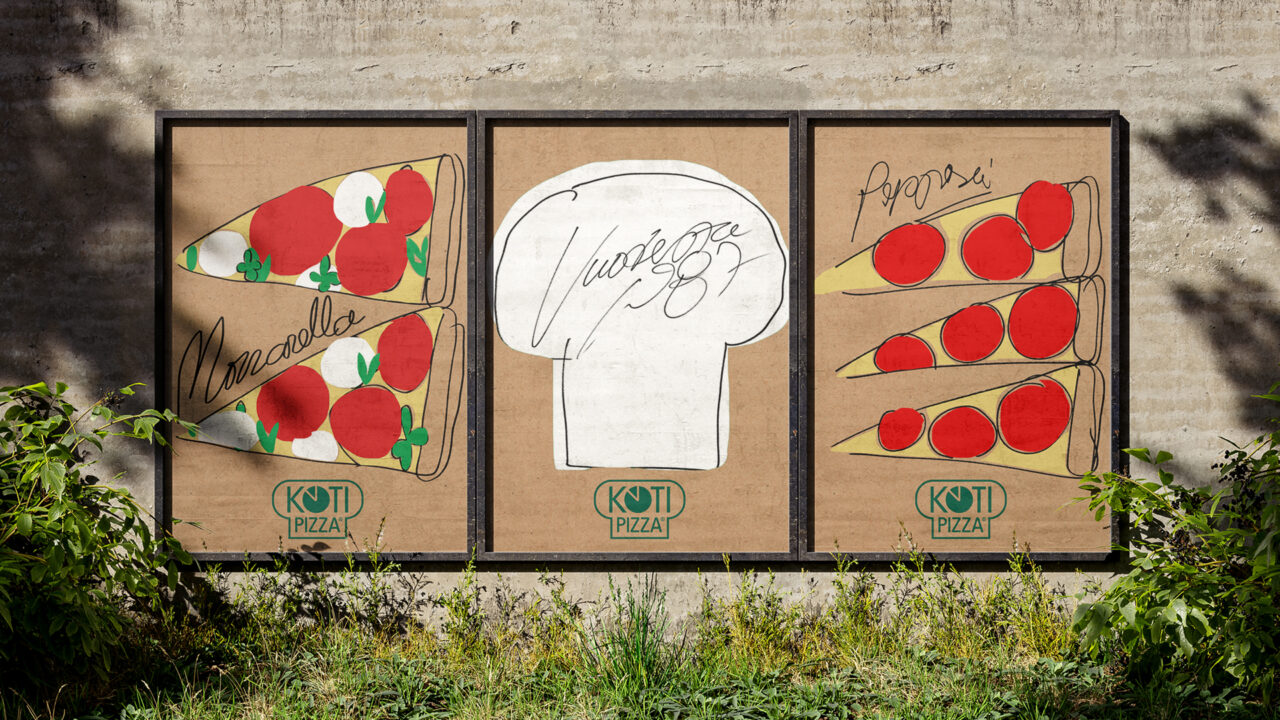
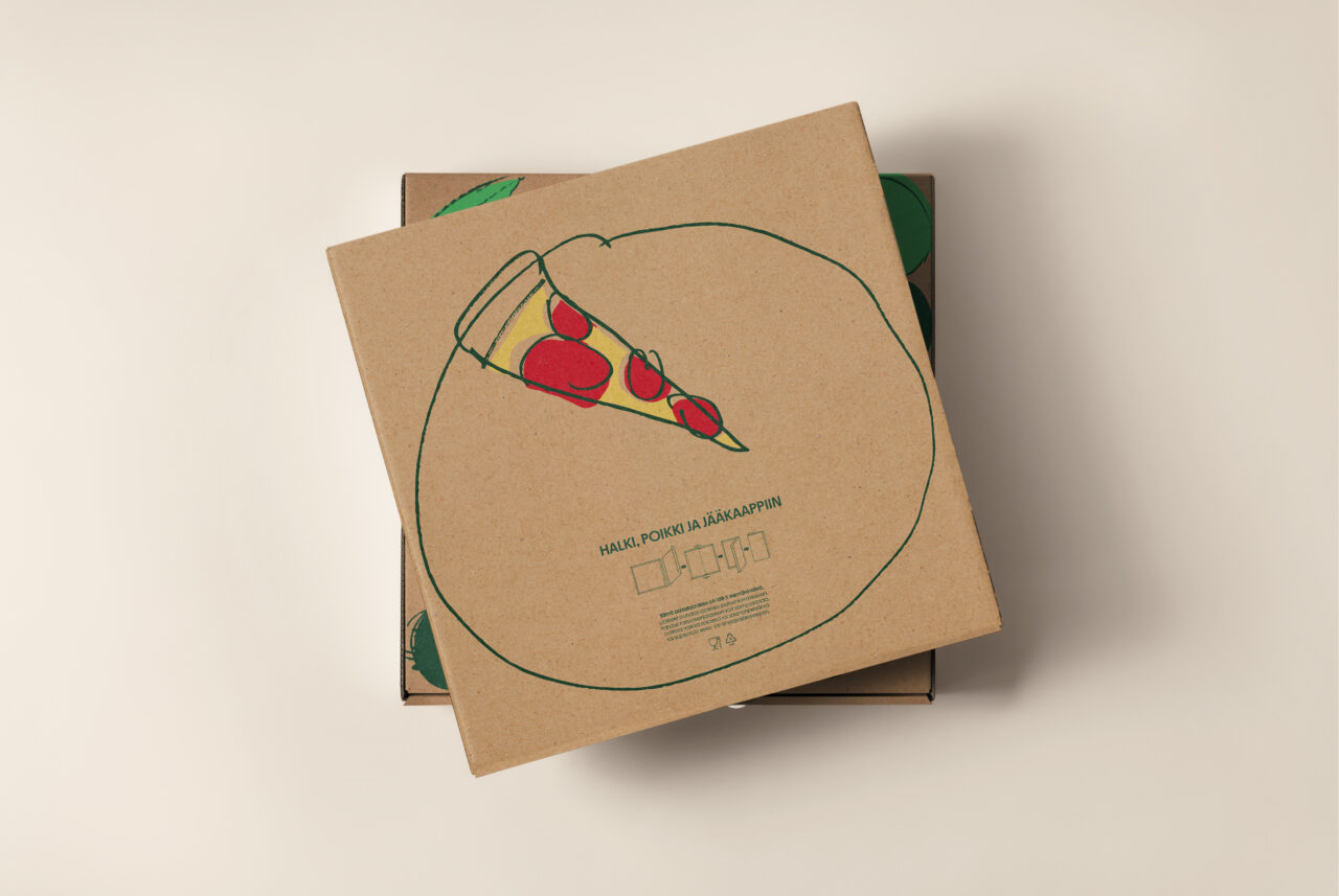
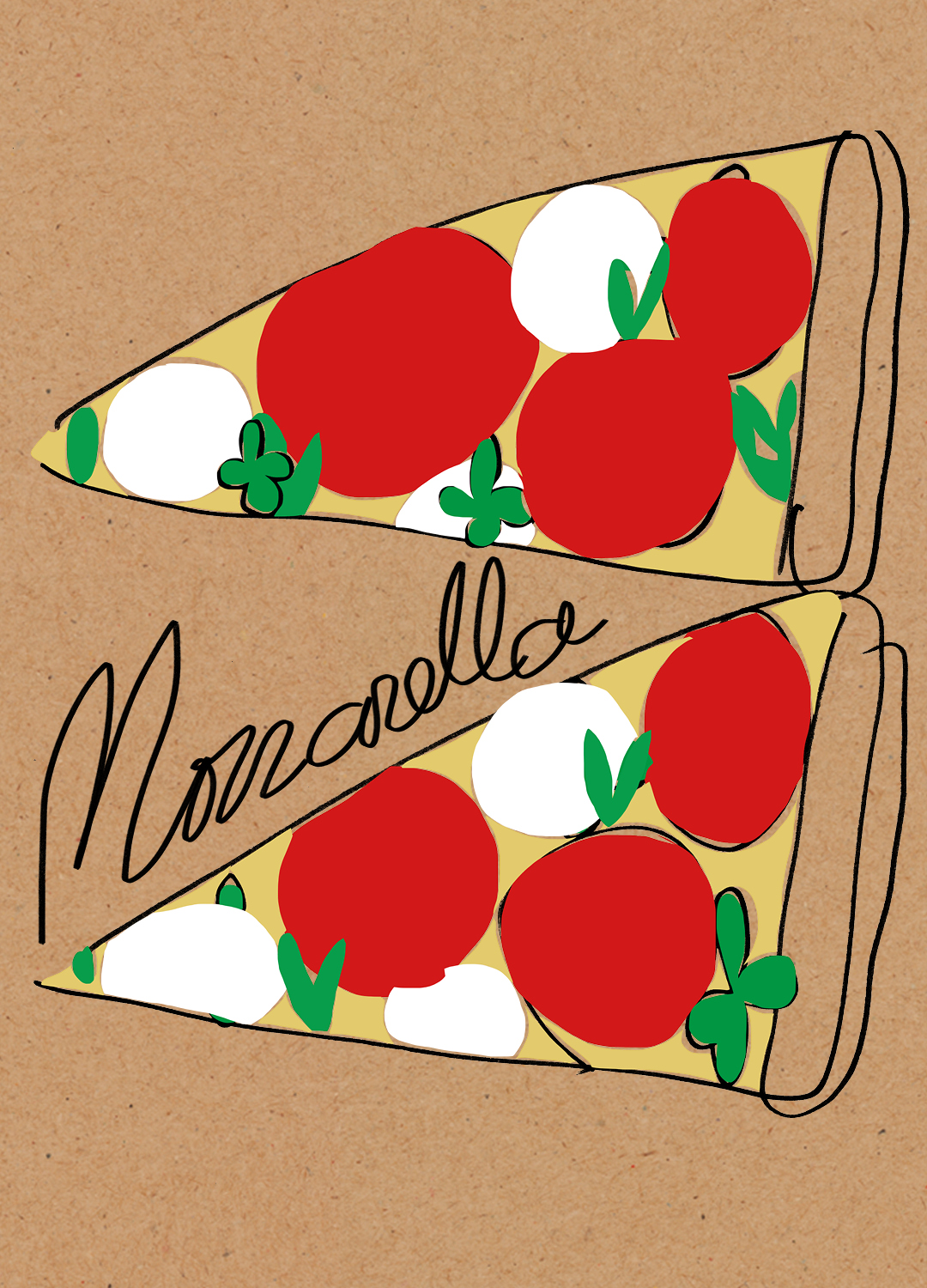
The soft, Bauhaus-rooted typeface gives the brand a friendly, modern voice. Hand-drawn illustrations by Antti Kalevi, add warmth and craft. In motion, the chef’s hat comes to life: it gives a thumbs-up, shows appreciation and stretches like pizza dough. The system extends across packaging, restaurant interiors and exteriors, and digital commerce. The result is a brand that feels instantly familiar yet refreshingly new.
Design development.